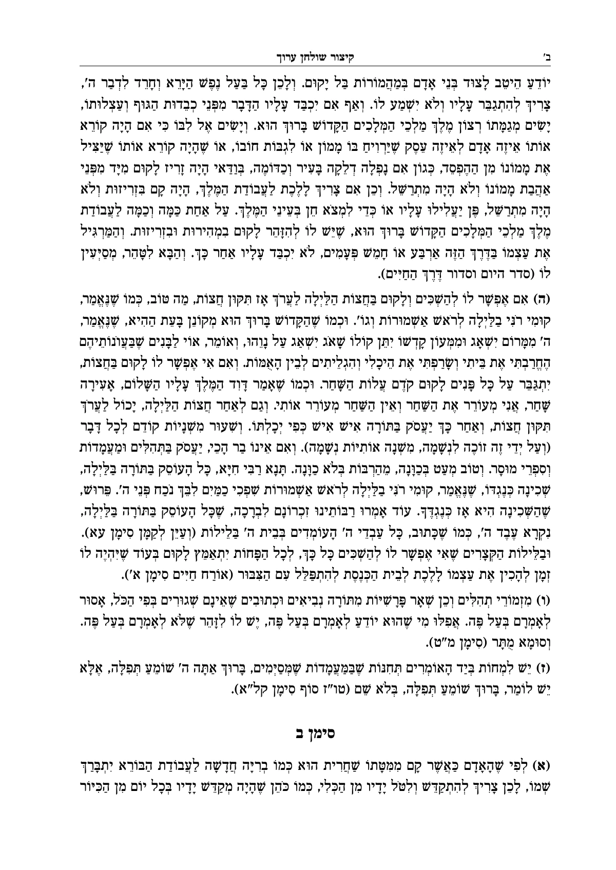
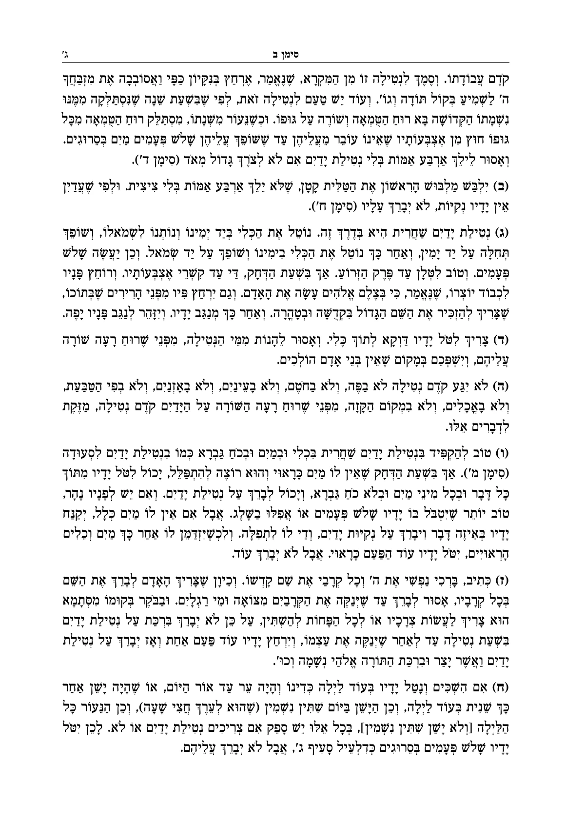
What typesetting is, and why it matters
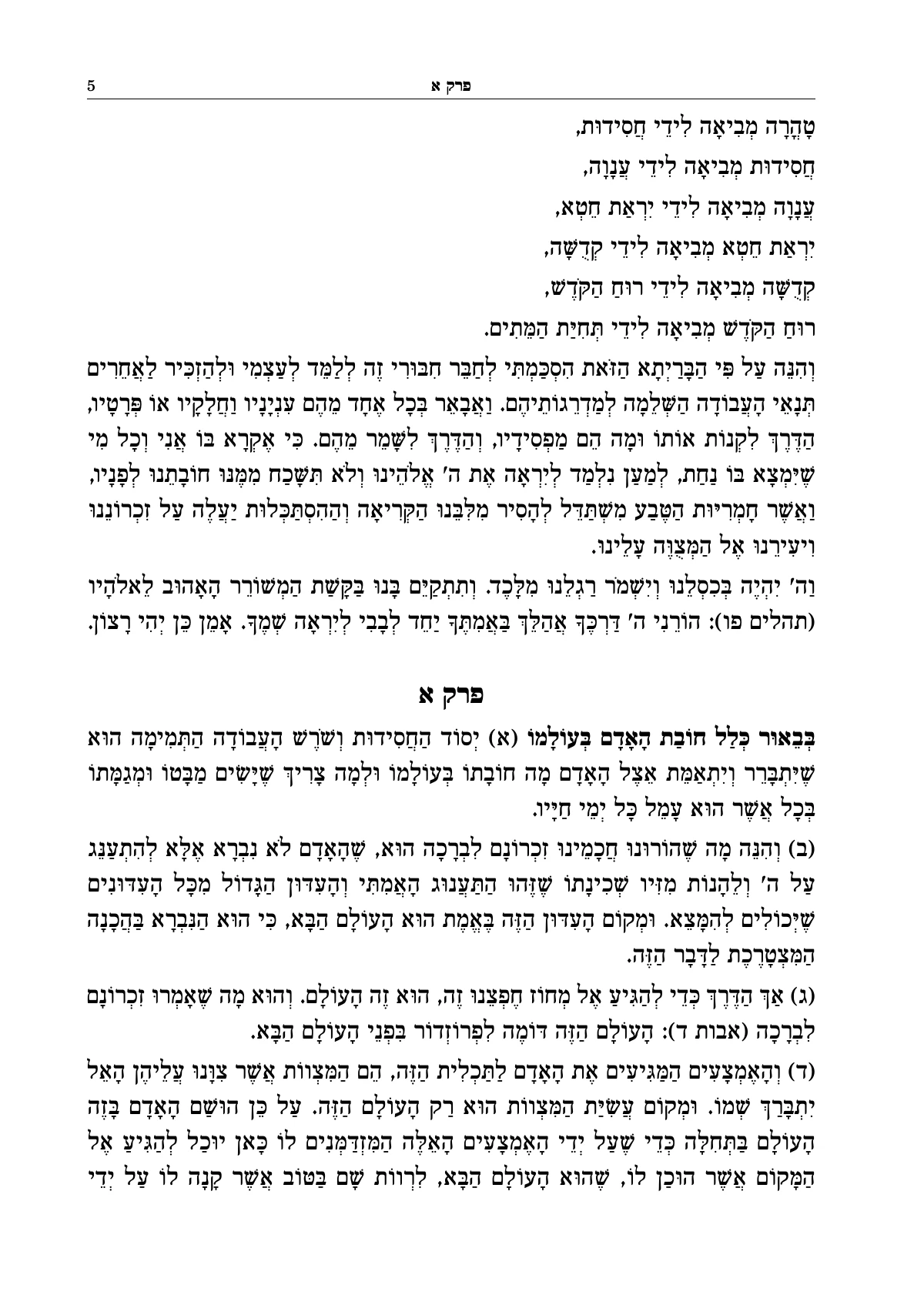
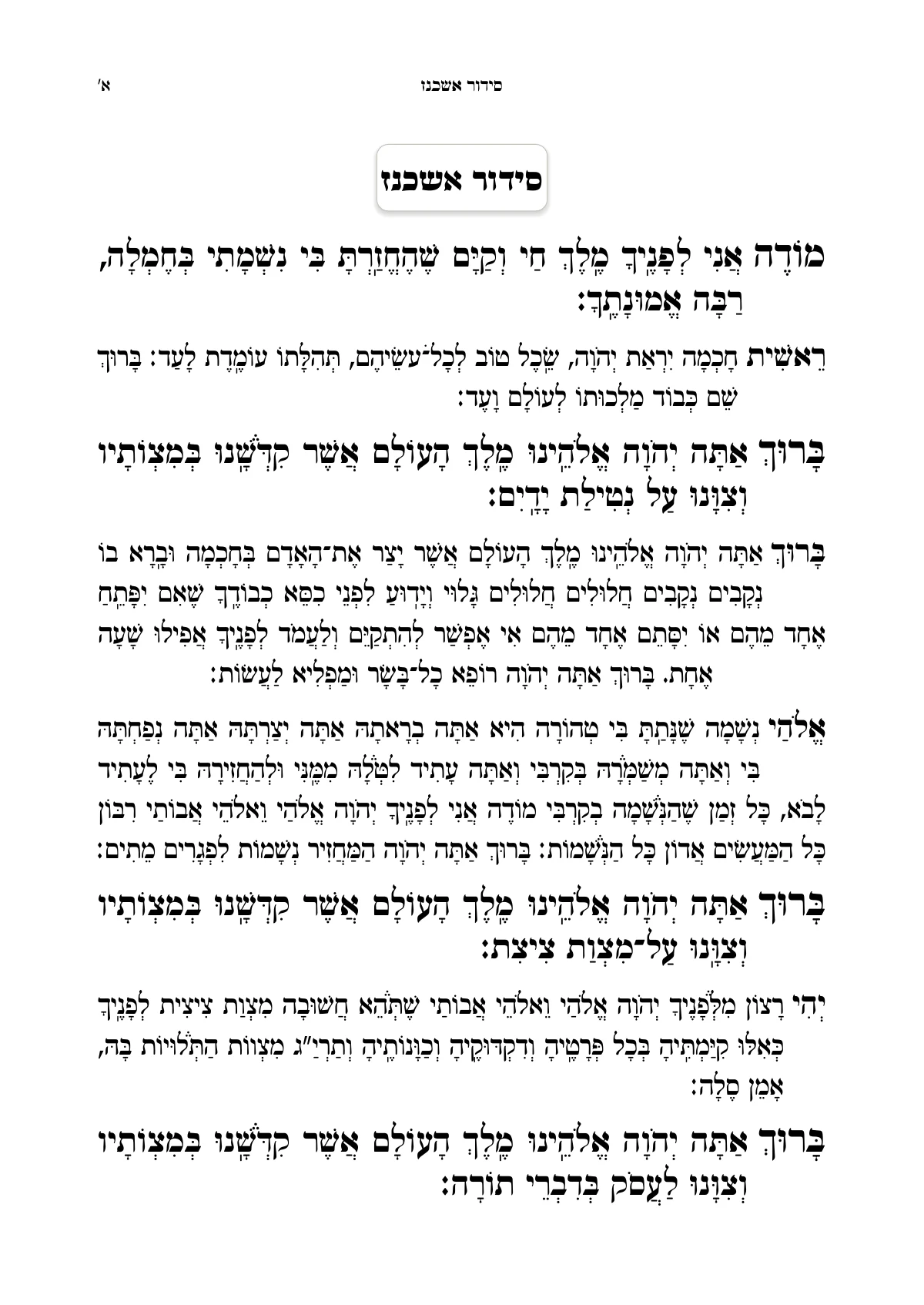
Typesetting is what turns a text into a book. The very same words can look like a document printed at the office, or like a sefer that is a pleasure to hold and open. The difference is in the details: the typeface, the line spacing, the margins, where the notes go, and whether all the pages end at the same height.
In a sefer, typesetting has one more job. Readers are used to a certain form: they know where to look for the note, where the commentary is and where the source reference is. Good typesetting goes unnoticed. It simply doesn't get in the way of learning.
The steps of typesetting, from the text to the printer
These are the steps every book goes through, in any software. Each step says what you decide in it, and what Ariach does in it for you.
Finish the text
Typesetting starts when the content is complete and has had a first proofreading. Every large change after typesetting costs time. It is worth marking the headings in Word with heading styles already, and writing the notes as footnotes.
Set the page size and margins
A common size for seforim is 17 × 24 cm, and it varies a little from one print shop to the next. The inside margins, on the side of the binding, need to be wide enough that the text isn't swallowed by it.
In Ariach: you pick a size from a list, and the pages are laid out again at once.
Choose a font and type size
Square letters for the main text, and sometimes Rashi script for the commentaries. Text with nikud needs more line spacing, so that the nikud and taamim don't touch the line below.
In Ariach: Hebrew fonts for seforim, and fonts of your own that you add. The line spacing makes room for nikud and taamim.
Design the headings and styles
Chapter heading, subheading, normal paragraph, quotation. You set each style once, and it applies throughout the book. That keeps the book consistent, and one change fixes all of it.
In Ariach: a ready-made design sets all the styles together, and you can change any of them.
Arrange the notes and commentaries
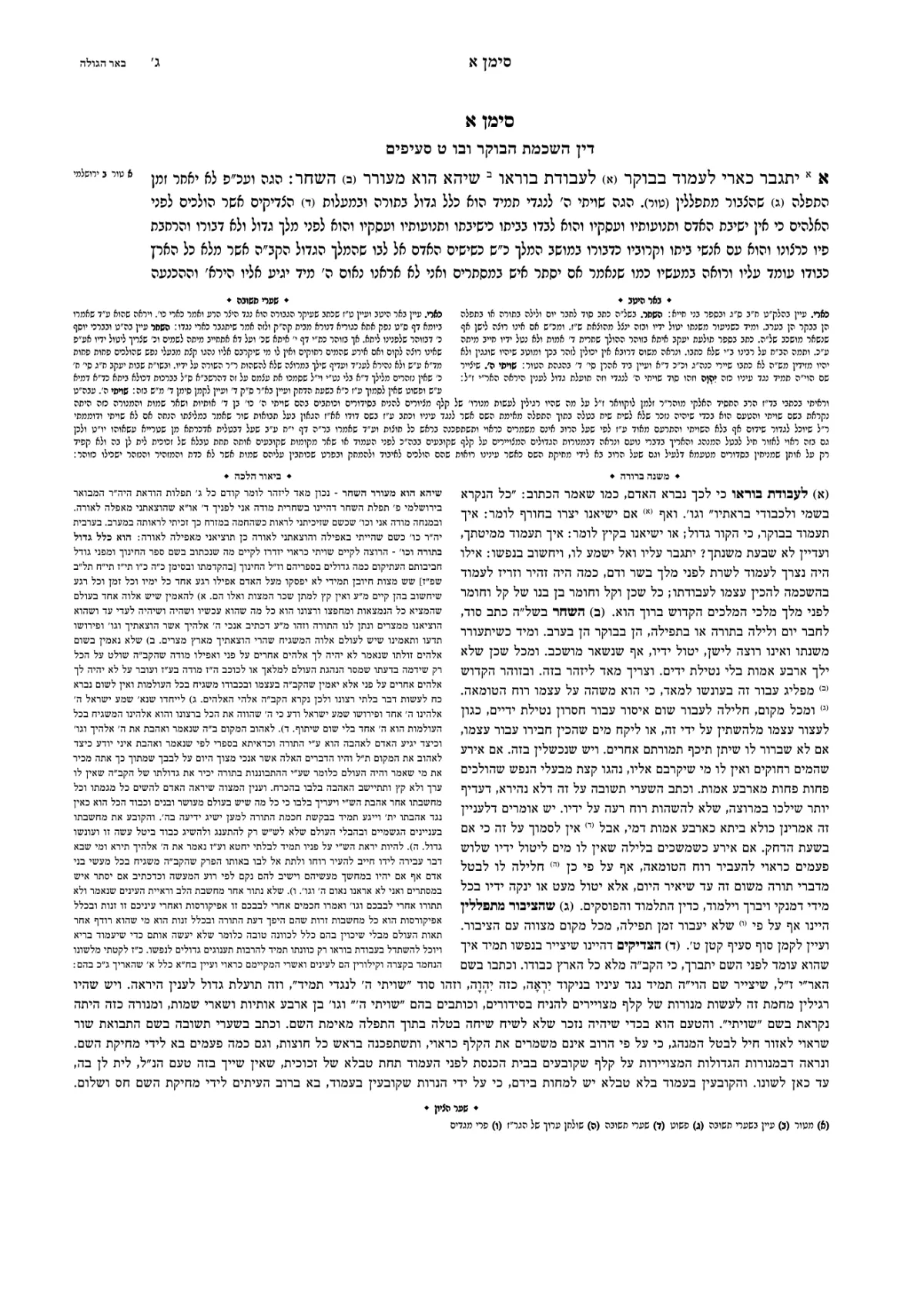
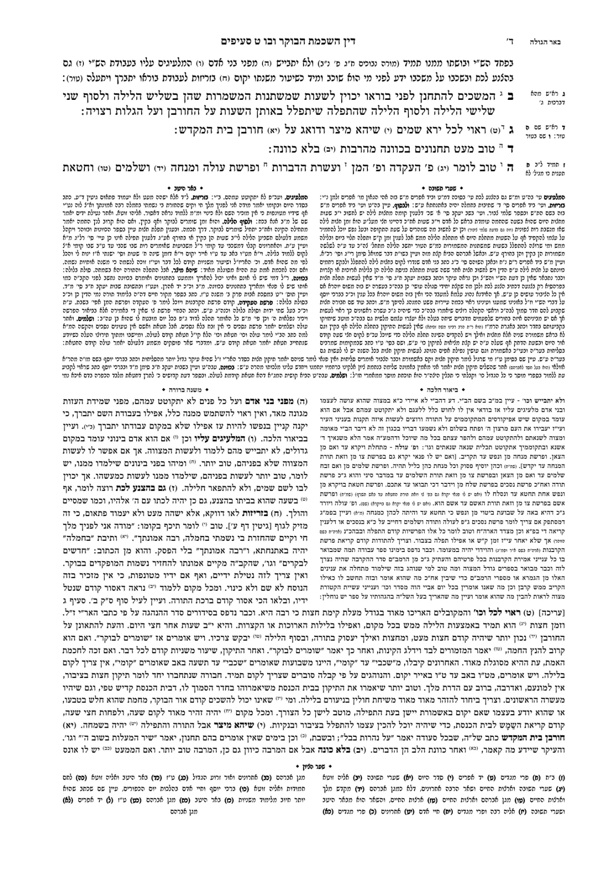
Decide where they will stand: at the bottom of the page, in columns, or around the text. Either way, a note has to be on the page where the word it was written on appears.
In Ariach: every note is anchored to its word and stays on the same page with it, even after you add a paragraph at the start of the book.
Add running heads and page numbers
The name of the sefer and of the chapter at the top of the page, and the page number in digits or in Hebrew letters. Seforim in the style of the Gemara are numbered by daf and amud.
In Ariach: a running head that changes with the chapter, and numbering in Hebrew letters, in digits, or by daf and amud.
Balance the pages
This is the step that separates professional typesetting from amateur work: pages that end at the same height, columns that end on the same line, and no heading left alone at the bottom of a page. By hand, this is the longest part of the job.
In Ariach: the engine balances the whole book at once. A page that didn't work out is flagged, with the reason and with what you can do about it.
Build a table of contents
The table of contents is built from the headings, with the page numbers. After every change to the book you have to make sure the numbers are still right.
In Ariach: the table of contents builds itself and is updated with the book.
Proofread the typeset book
Read the book as it will be printed. At this stage mistakes turn up that weren't seen in Word, and so do typesetting problems. Every correction can move pages, so after the corrections you go over the pages again.
In Ariach: the proofreader reads the same book, comments and suggests corrections, the book's owner approves them, and the pages are laid out again. Source references and quotations are checked against the Otzaria library.
Produce a PDF for print
One file, at the final size, with the settings the print shop asked for: black only or color, bleed and crop marks.
In Ariach: the PDF is identical to the pages on the screen.
A short glossary of sefer typesetting
The terms you will hear from a typesetter or a print shop, in plain words.
- Typesetting
- Arranging the text on the pages of a book; the person who does it is a typesetter. Sometimes called “composing,” from the days when letters were set by hand.
- Multi-text
- A book in which several texts stand on the same page and depend on one another: a main text, commentaries and notes.
- Tzuras HaDaf
- The classic Vilna page layout of the Gemara: the main text in the middle, with the commentaries wrapped around it on both sides.
- Running head
- The line at the top of every page: the name of the sefer, the chapter or the topic, and sometimes the page number.
- Dibbur hamaschil
- The words from the text with which a commentator's passage opens. They tell you next to which word the passage belongs.
- Catchword
- The first word of the next page, printed at the bottom of the page. Customary in seforim in the style of the old printings, and it can be turned on in Ariach.
- Drop cap
- A space opened at the start of a paragraph for a large first word that takes up several lines.
- Bleed
- A few millimeters of printing beyond the trim line, so that no white strip is left at the edge of the page. Needed when there is color or a frame that runs to the edge.
- Rashi script
- The typeface in which Rashi and the other commentators are printed in traditional editions, as distinct from the square letters of the main text.
- Source reference
- Where a quotation comes from: the sefer, the chapter and the daf. It stands in parentheses in the text or in a note.
Where to start
The quickest way to understand typesetting is to watch a book being typeset in front of you. Ariach's sample book opens without signing up: change a word in it, and the pages are laid out again.
- The text is already written in Word: typesetting a sefer from Word.
- A short sefer or a booklet: typesetting a kuntres or booklet.
- A sefer with commentaries around the text: typesetting in Tzuras HaDaf.
- Thinking of handing the work to a typesetter: what typesetting a book costs.